" width="74.99999422623364px"/><path d="M 74.998 3.896 C 74.998 3.413 74.636 2.868 74.353 2.7 C 74.071 2.533 73.456 2.6 73.133 2.759 C 71.058 3.772 69.065 4.671 66.836 5.273 C 58.129 7.625 50.331 6.788 41.88 3.955 C 33.974 1.305 28.047 -0.649 19.515 0.201 C 14.297 0.721 9.371 2.087 4.655 4.315 C 4.13 2.999 2.951 2.411 1.818 2.714 C 0.858 2.97 -0.298 4.126 0.07 5.351 L 6.332 26.19 L 16.378 59.229 L 20.345 72.186 C 20.779 73.602 22.145 74.273 23.448 73.895 C 24.72 73.525 25.451 72.246 25.01 70.805 L 17.595 46.554 C 25.961 43.206 33.933 43.537 42.284 46.454 C 52.871 50 63.646 50.189 73.742 45.17 C 74.569 44.759 75 44.181 75 43.206 Z M 47.795 31.938 C 42.319 34.925 36.211 34.998 30.733 32.203 C 27.018 30.287 23.799 27.609 21.138 24.333 C 23.95 20.893 27.284 18.154 31.166 16.228 C 36.204 13.865 41.74 13.823 46.781 16.184 C 50.743 18.105 54.101 20.911 56.839 24.391 C 54.243 27.513 51.344 30.042 47.794 31.938 Z" fill="rgb(17, 17, 17)" height="73.99893922198277px" id="MIuncyhrb" transform="translate(0 0)" width="75px"/><path d="M 14.835 8.797 C 14.345 11.525 12.414 13.694 10.062 14.508 C 7.199 15.499 4.244 14.814 2.249 12.753 C -0.393 10.024 -0.741 6.159 1.384 3.156 C 3.426 0.268 7.352 -0.947 10.762 0.83 C 9.111 1.27 7.986 2.343 8.014 3.842 C 8.044 5.435 9.32 6.638 10.803 6.663 C 12.386 6.688 13.69 5.554 13.775 3.785 C 14.888 5.144 15.159 7.007 14.837 8.798 Z" fill="rgb(17, 17, 17)" height="14.955654229814664px" id="qhrjz5m__" transform="translate(31.488 16.879)" width="14.963309976210699px"/></g></svg>)
Client
Starknet Foundation
Type
Brand System Design
Year
2024|2025
Role
Brand Designer @ Starknet Foundation
As part of the design team, I designed the brand system and visual language that would scale across communications, developer resources, and educational programs.
Challenges
🌊 Standing out in a sea of sameness
Most Web3 brands look identical: purple gradients and techy clichés. The Foundation needed a visual identity that honored the Starknet ecosystem while feeling contemporary, elegant, and accessible.
🎯 Serving everyone without losing focus
The Foundation speaks to developers, institutions, and everyday users. The brand had to flex across technical docs, governance proposals, and community content while staying cohesive.
🔄 Honoring the past while moving forward
The Foundation needed its own identity, but it couldn't abandon Starknet. The challenge was evolution, not revolution: building on existing brand equity without copying what came before.
Concepts
🧩 Ideas are modular, evolving, and interconnected
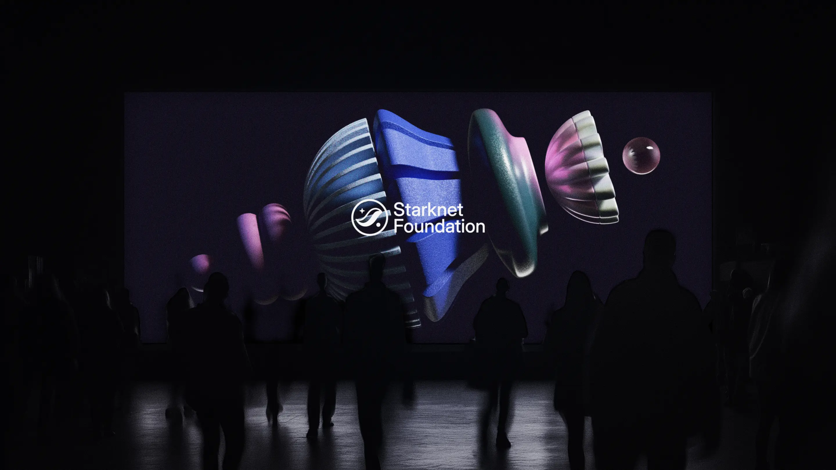
I built the system around "Totems", stacked shapes that represent how ideas compound, evolve, and build on each other. This concept became the foundation for every visual decision.
📊 Three visual styles for three stages of thought
We developed a tiered graphic system that mirrors the journey from concept to execution:
Solid = raw ideas (clean, minimal, playful)
Linear = structure (technical, precise, intentional)
Volumetric = realization (expressive, dimensional, fully formed)
This gave the brand flexibility to adapt to any context while staying unmistakably Starknet Foundation.
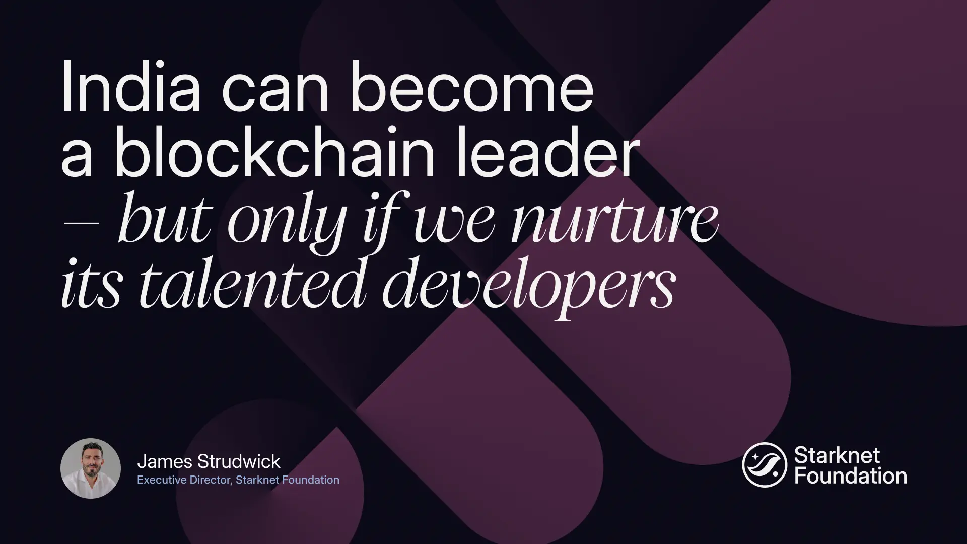
🎨 Break the Web3 aesthetic rules
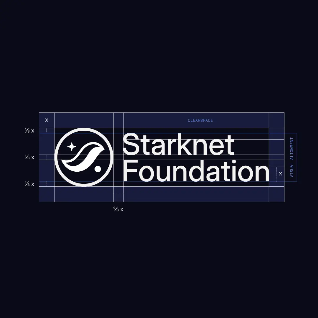
We chose a contemporary serif with a sans serif next to a desaturated palette spanning the full color wheel. The result: a brand that feels timeless, premium, and memorable.
Solution
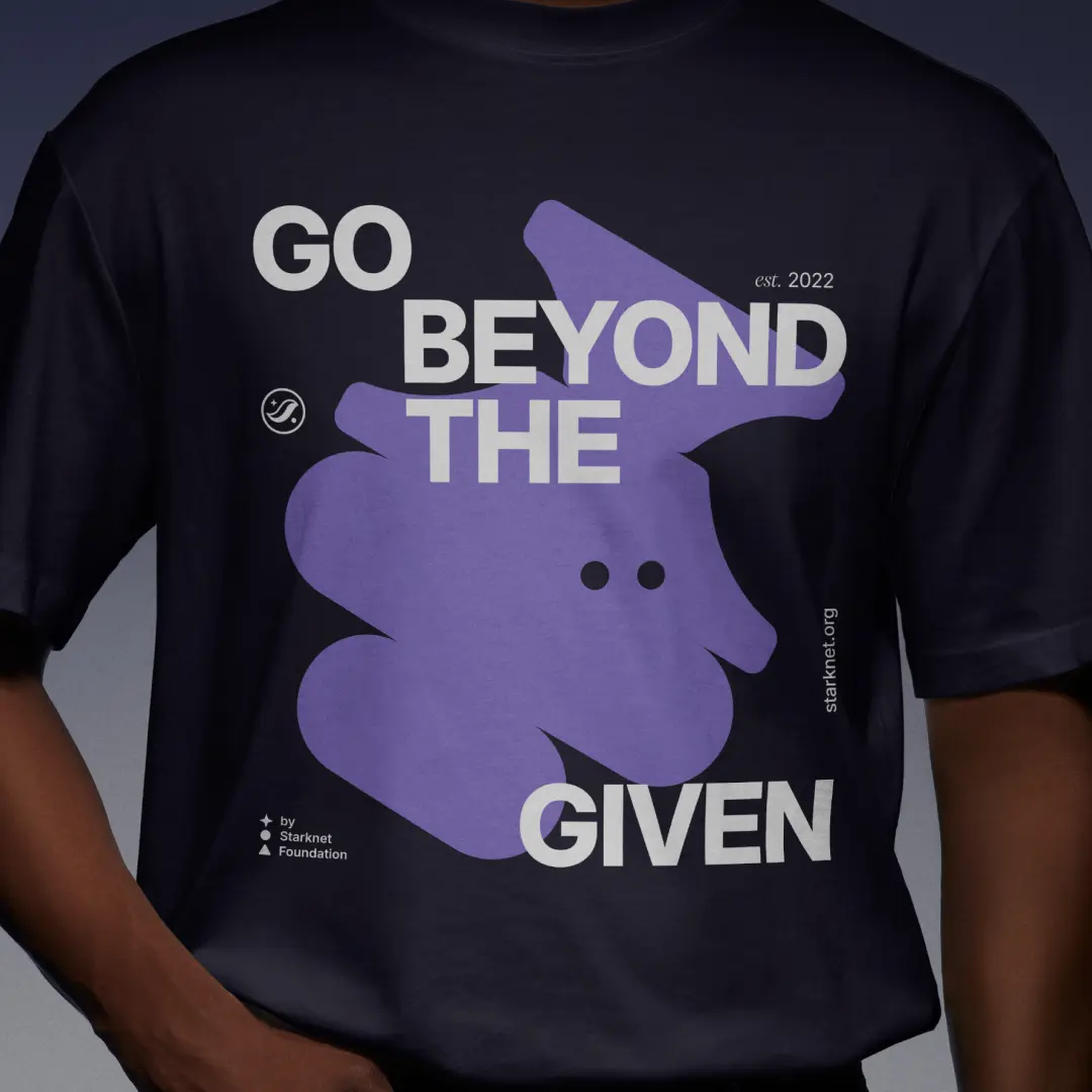
🔷 A brand system built on shapes and totems
Fluid, abstract shapes became the visual foundation. They can exist alone or stack into totems: modular compositions that feel irregular, layered, and intentionally imbalanced. These shapes are the connective tissue across all applications, from technical diagrams to merchandise.
⚡ Three distinct styles
The Solid, Linear, and Volumetric styles gave the Foundation a flexible visual vocabulary. Each style serves a specific purpose:
Solid for community and accessibility
Linear for technical and developer contexts
Volumetric for hero moments and storytelling
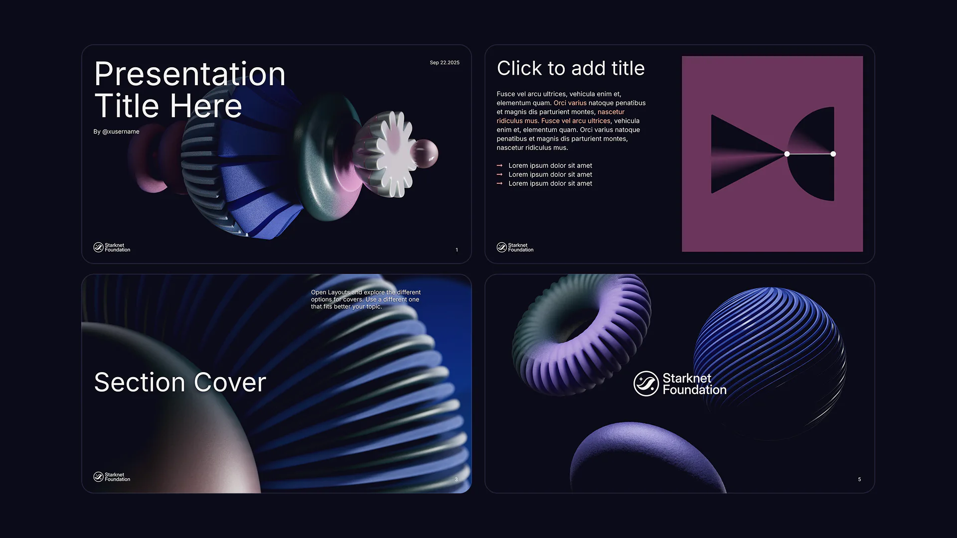
📦 A complete system ready to scale
Logo system with clear hierarchy
Typography pairing (Inter Variable + PP Pangaia serif)
Full-spectrum desaturated color palette
Modular shape system with infinite applications
NFT Collection (Starkies) for community engagement
Guidelines for charts, diagrams, photo frames, and motion
NFT Collectible
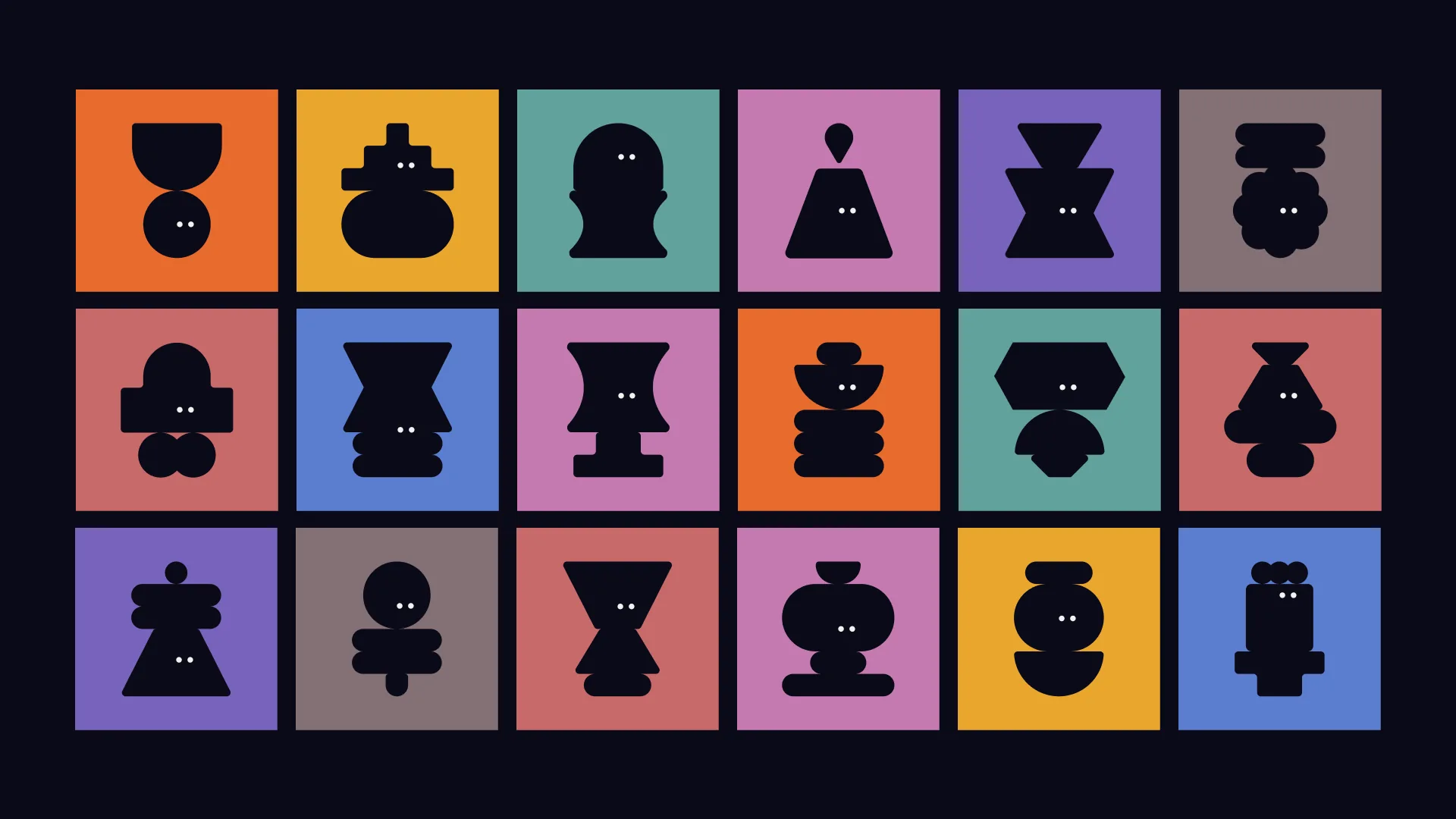
🎭 Starkies
I designed Starkies, a collection of modular character illustrations that function as the Foundation's most playful and approachable brand expression. Built entirely from the Solid style shapes, each Starkie is constructed from 2-4 stacked shapes with minimal eyes for personality.
These characters work as NFTs, profile pictures, community badges, and merchandise graphics, humanizing the Foundation's presence across digital and physical spaces while staying true to the brand's modular system.
Team
Julian Alterini – Lead
Jaime Fernandez – Brand Design
Isabelle Junge – Brand Design
Laura Piccolo – Web Design
Pete Duffield – Web Design
Tomas Cech – Developer
💛 Gracias