Client
Starknet Foundation
Type
Brand Identity, Motion
Year
2024
Role
While at the Starknet Foundation I created the brand identity and motion work for Startup House. The task was to understand the needs of the program and create a compelling brand identity that could scale into new editions.
The identity was documented into a brand guideline to ease the creation of future events.
Challenge
Starknet Foundation needed a bold, adaptable identity for Startup House, their fast-track accelerator for early-stage teams with live MVPs on Starknet. The program delivers intense mentorship, technical deep-dives, go-to-market strategy, and investor intros.
The system needed to be modular and expandable as Startup House runs multiple editions globally, each requiring its own visual identity while maintaining brand continuity.
Insight
Startups are experimental, technical, and often pushing boundaries. The visual identity needed to mirror that energy: raw, kinetic, unapologetically bold. Static branding would feel mismatched to a program about velocity, iteration, and breaking through.
The challenge: create a system that's daring and memorable without becoming chaotic. One that can be recolored, remixed, and redeployed across continents without losing its DNA.
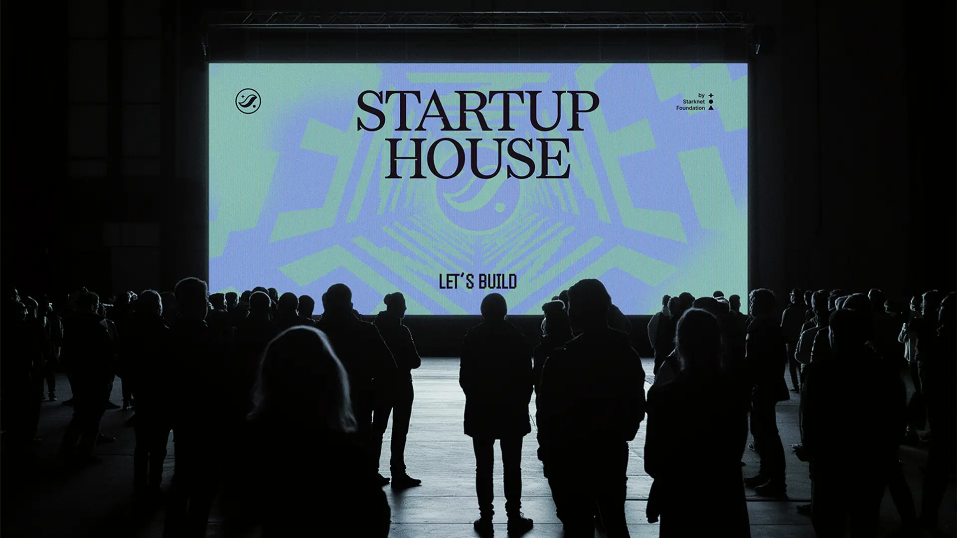
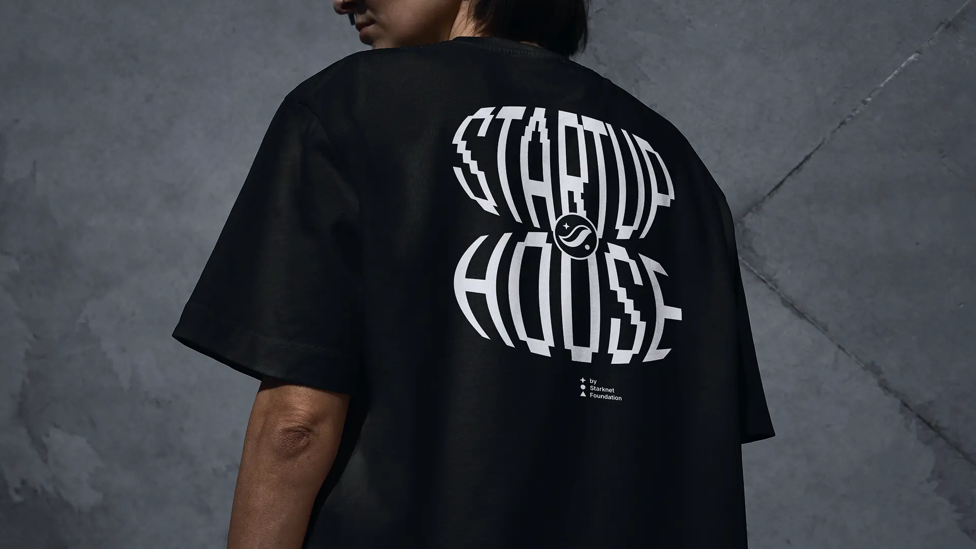
Solution
A typographic identity system built around ✨ animated kinetic motion loops. The core element is bold, condensed type (HandJet, an open-source pixelated condensed font) arranged in dense, overlapping compositions that create abstract visual texture when animated.
The System Works Like This:
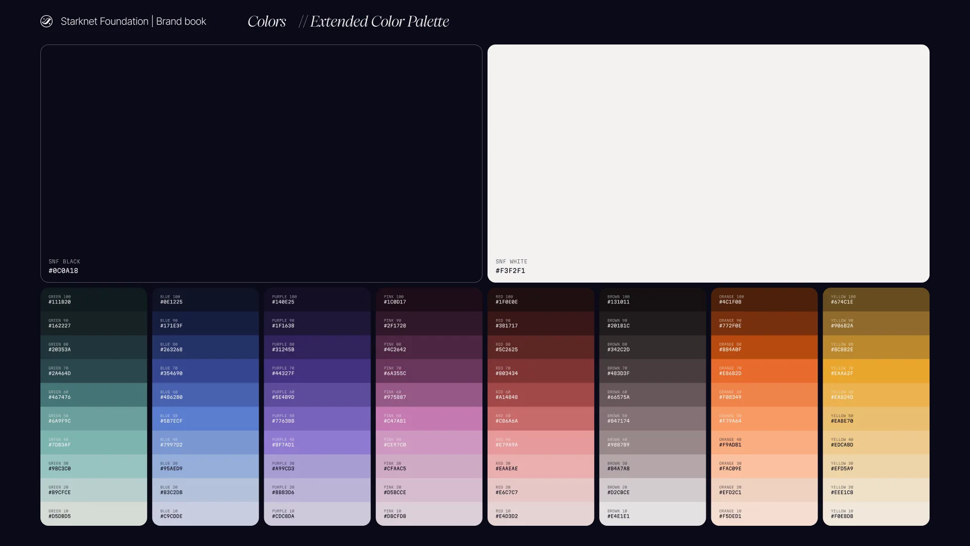
💃 Modular Color
Each Startup House edition gets its own signature color palette. Cannes launched with one set; Buenos Aires gets another. The typography and animation logic stay the same only the color shifts. This allows global consistency with local differentiation.
🅰️ Kinetic Typography as Background
Instead of static layouts, the identity lives in motion. Typographic backgrounds loop continuously, creating dynamic compositions for social media, event screens, presentations, and video content. The effect is hypnotic, technical, and distinctly non-corporate.
🪴 Scalable Guidelines
The deliverable included comprehensive brand guidelines documenting the modular color-swap system, animation principles, typography rules, and applications. Future editions can be deployed by regional teams without redesigning from scratch.
🎨 As an initiative created by the Starknet Foundation all colors derive from their extended color palette.
💛 Gracias


" width="74.99999422623364px"/><path d="M 74.998 3.896 C 74.998 3.413 74.636 2.868 74.353 2.7 C 74.071 2.533 73.456 2.6 73.133 2.759 C 71.058 3.772 69.065 4.671 66.836 5.273 C 58.129 7.625 50.331 6.788 41.88 3.955 C 33.974 1.305 28.047 -0.649 19.515 0.201 C 14.297 0.721 9.371 2.087 4.655 4.315 C 4.13 2.999 2.951 2.411 1.818 2.714 C 0.858 2.97 -0.298 4.126 0.07 5.351 L 6.332 26.19 L 16.378 59.229 L 20.345 72.186 C 20.779 73.602 22.145 74.273 23.448 73.895 C 24.72 73.525 25.451 72.246 25.01 70.805 L 17.595 46.554 C 25.961 43.206 33.933 43.537 42.284 46.454 C 52.871 50 63.646 50.189 73.742 45.17 C 74.569 44.759 75 44.181 75 43.206 Z M 47.795 31.938 C 42.319 34.925 36.211 34.998 30.733 32.203 C 27.018 30.287 23.799 27.609 21.138 24.333 C 23.95 20.893 27.284 18.154 31.166 16.228 C 36.204 13.865 41.74 13.823 46.781 16.184 C 50.743 18.105 54.101 20.911 56.839 24.391 C 54.243 27.513 51.344 30.042 47.794 31.938 Z" fill="rgb(17, 17, 17)" height="73.99893922198277px" id="MIuncyhrb" transform="translate(0 0)" width="75px"/><path d="M 14.835 8.797 C 14.345 11.525 12.414 13.694 10.062 14.508 C 7.199 15.499 4.244 14.814 2.249 12.753 C -0.393 10.024 -0.741 6.159 1.384 3.156 C 3.426 0.268 7.352 -0.947 10.762 0.83 C 9.111 1.27 7.986 2.343 8.014 3.842 C 8.044 5.435 9.32 6.638 10.803 6.663 C 12.386 6.688 13.69 5.554 13.775 3.785 C 14.888 5.144 15.159 7.007 14.837 8.798 Z" fill="rgb(17, 17, 17)" height="14.955654229814664px" id="qhrjz5m__" transform="translate(31.488 16.879)" width="14.963309976210699px"/></g></svg>)
